
Michael Dorman
Geography and Environmental Development, BGU
2022-03-29
Several Python packages need to be installed and loaded to run the code examples:
import glob                       # File paths
import pandas as pd               # Tables
import shapely.geometry           # Vector geometries
import geopandas as gpd           # Vector layers
import seaborn as sns             # Plots (Heatmap)
import networkx as nx             # Network analysis
import networkx.algorithms        # Network analysis (community detection)
import textblob                   # Sentiment analysis
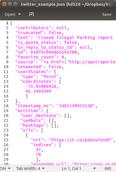
/home/michael/.local/lib/python3.8/site-packages/geopandas/_compat.py:111: UserWarning: The Shapely GEOS version (3.8.0-CAPI-1.13.1 ) is incompatible with the GEOS version PyGEOS was compiled with (3.10.1-CAPI-1.16.0). Conversions between both will be slow.
  warnings.warn(
import matplotlib.pyplot as plt
pd.options.display.max_rows = 6
pd.options.display.max_columns = 8
pd.options.display.max_colwidth = 35
plt.rcParams["figure.figsize"] = (18, 8)
%%html
<style>
.dataframe td {
    white-space: nowrap;
}
</style>
We also need to set the working directory to the folder with the data:
*.json—Boston tweetsborders.shp—County borders (Shapefile)network.csv—Twitter follower edge listlocations.csv—Twitter user locations

Our examples of working with LBSN data are going to focus on Twitter data. Like in most online social networks, Twitter has numerous ways to access and interact with the data:

To access the Twitter API we need to obtain API keys:
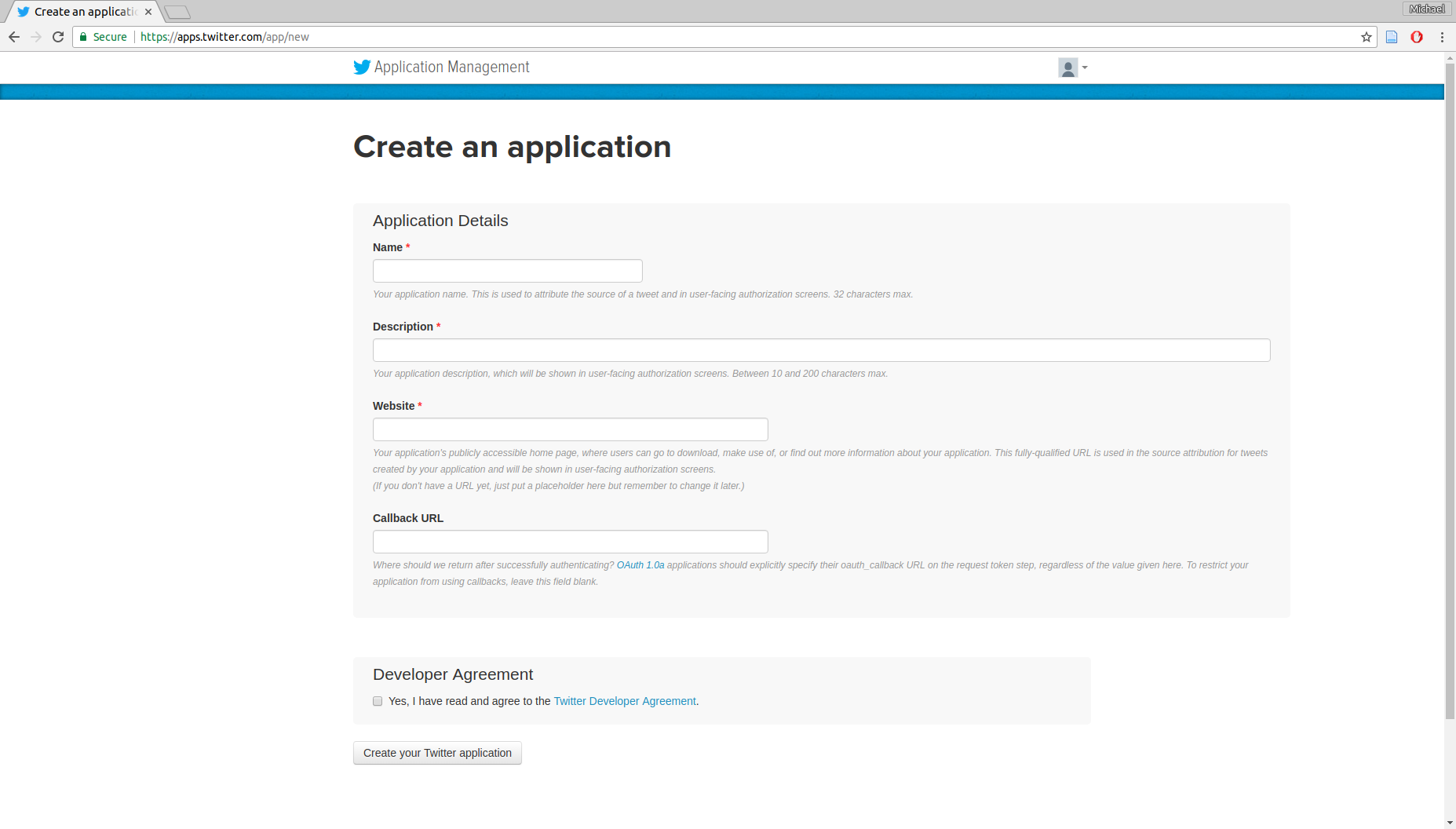


Once we have the API keys, Twitter APIs can be accessed using various software, such as Python package twarc. For example, the following script collects all available geo-referenced tweets in the area of Boston for an hour, from the Streaming API which provides tweets in real-time:
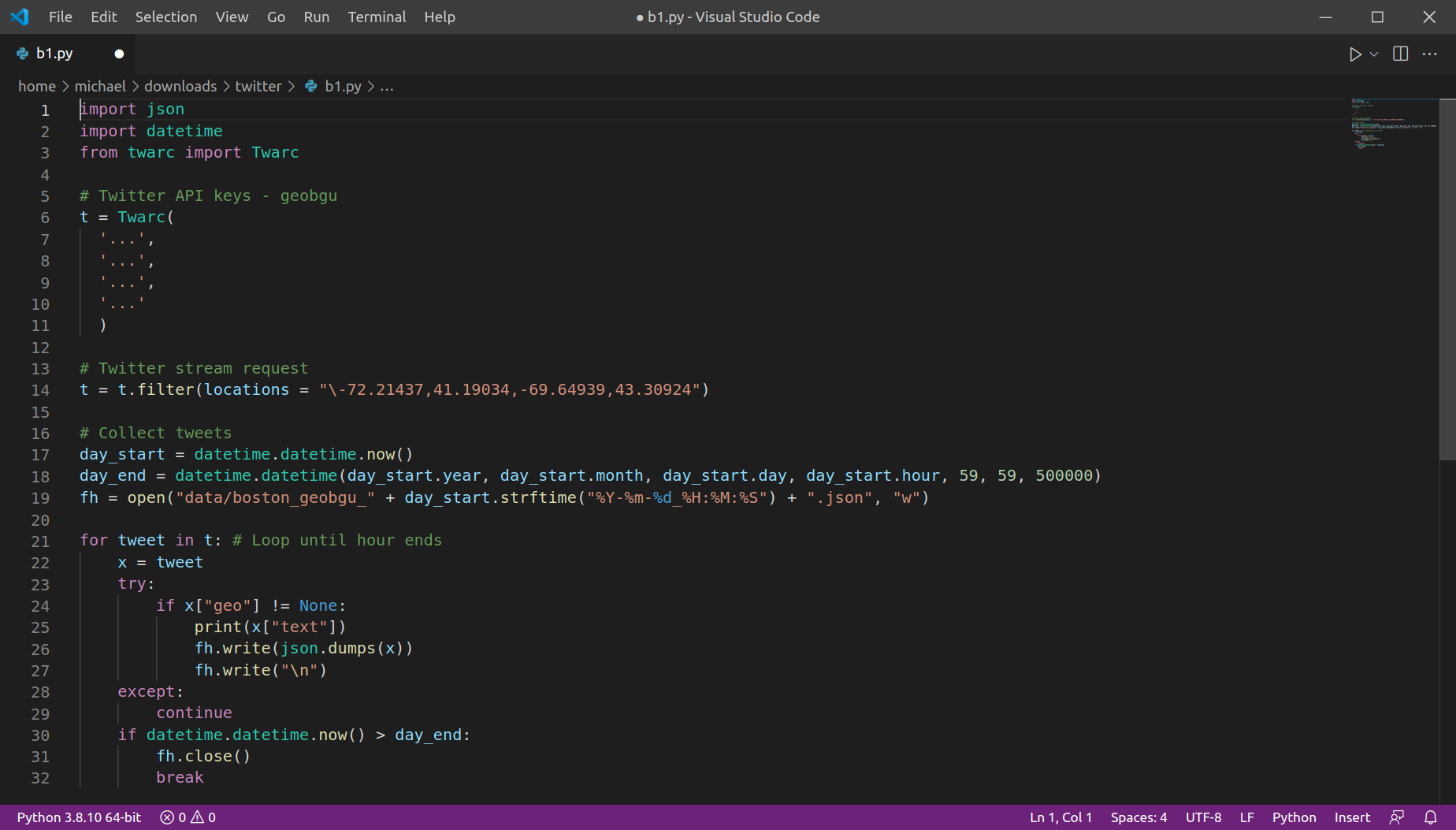
The twarc script records tweets into a .json file, until the end of the current hour. If we run the script repeatedly at the beginning of each hour, we can collect tweets for longer time periods, organized into numerous .json files (one file per hour).
To process the data, first of all we need to detect the required file paths. For example, the following expression gets the file paths of all hours in 2022-03-11:
files = glob.glob("data/boston_*_2022-03-11*.json")
files.sort()
files
['data/boston_geobgu_2022-03-11_00:00:02.json',
 'data/boston_geobgu_2022-03-11_01:00:01.json',
 'data/boston_geobgu_2022-03-11_02:00:01.json',
 'data/boston_geobgu_2022-03-11_03:00:02.json',
 'data/boston_geobgu_2022-03-11_04:00:02.json',
 'data/boston_geobgu_2022-03-11_05:00:02.json',
 'data/boston_geobgu_2022-03-11_06:00:02.json',
 'data/boston_geobgu_2022-03-11_07:00:00.json',
 'data/boston_geobgu_2022-03-11_08:00:02.json',
 'data/boston_geobgu_2022-03-11_09:00:02.json',
 'data/boston_geobgu_2022-03-11_10:00:01.json',
 'data/boston_geobgu_2022-03-11_11:00:02.json',
 'data/boston_geobgu_2022-03-11_12:00:02.json',
 'data/boston_geobgu_2022-03-11_13:00:01.json',
 'data/boston_geobgu_2022-03-11_14:00:02.json',
 'data/boston_geobgu_2022-03-11_15:00:00.json',
 'data/boston_geobgu_2022-03-11_16:00:00.json',
 'data/boston_geobgu_2022-03-11_17:00:02.json',
 'data/boston_geobgu_2022-03-11_18:00:02.json',
 'data/boston_geobgu_2022-03-11_19:00:01.json',
 'data/boston_geobgu_2022-03-11_20:00:00.json',
 'data/boston_geobgu_2022-03-11_21:00:02.json',
 'data/boston_geobgu_2022-03-11_22:00:02.json',
 'data/boston_geobgu_2022-03-11_23:00:00.json']
Next, we can read the files in a loop and combine them into one long table (DataFrame), using the pandas package:
dat = []
for i in files:
    tmp = pd.read_json(i, lines=True)
    dat.append(tmp)
dat = pd.concat(dat, axis=0)
dat = dat.sort_values("created_at")
dat = dat.reset_index(drop=True)
dat
| created_at | id | id_str | text | ... | quoted_status_id | quoted_status_id_str | quoted_status | quoted_status_permalink | |
|---|---|---|---|---|---|---|---|---|---|
| 0 | 2022-03-10 21:59:58+00:00 | 1502041600670650368 | 1502041600670650368 | Looking for a new opportunity a... | ... | NaN | NaN | NaN | NaN |
| 1 | 2022-03-10 22:00:03+00:00 | 1502041619343810560 | 1502041619343810560 | It's 5 o'clock in Marblehead. | ... | NaN | NaN | NaN | NaN |
| 2 | 2022-03-10 22:00:06+00:00 | 1502041631851167750 | 1502041631851167744 | Wind 0 mph -. Barometer 30.10 i... | ... | NaN | NaN | NaN | NaN |
| ... | ... | ... | ... | ... | ... | ... | ... | ... | ... |
| 1769 | 2022-03-11 21:59:20+00:00 | 1502403827588231170 | 1502403827588231168 | See our latest #Raynham, MA Pha... | ... | NaN | NaN | NaN | NaN |
| 1770 | 2022-03-11 21:59:20+00:00 | 1502403825658851328 | 1502403825658851328 | Help pave the path to equitable... | ... | NaN | NaN | NaN | NaN |
| 1771 | 2022-03-11 21:59:25+00:00 | 1502403847368675328 | 1502403847368675328 | I'm at Harpoon Brewery in Bosto... | ... | NaN | NaN | NaN | NaN |
1772 rows × 35 columns
The resulting table contains a lot of variables. We will keep just the most useful ones:
created_at—Time when the tweet was posteduser—User propertiescoordinates—Geographic locationtext—Tweet textlang—Tweet languagevars = ["created_at", "user", "coordinates", "text", "lang"]
dat = dat[vars].copy()
dat
| created_at | user | coordinates | text | lang | |
|---|---|---|---|---|---|
| 0 | 2022-03-10 21:59:58+00:00 | {'id': 173349856, 'id_str': '17... | {'type': 'Point', 'coordinates'... | Looking for a new opportunity a... | en |
| 1 | 2022-03-10 22:00:03+00:00 | {'id': 2202066812, 'id_str': '2... | {'type': 'Point', 'coordinates'... | It's 5 o'clock in Marblehead. | en |
| 2 | 2022-03-10 22:00:06+00:00 | {'id': 217362857, 'id_str': '21... | {'type': 'Point', 'coordinates'... | Wind 0 mph -. Barometer 30.10 i... | en |
| ... | ... | ... | ... | ... | ... |
| 1769 | 2022-03-11 21:59:20+00:00 | {'id': 107912849, 'id_str': '10... | {'type': 'Point', 'coordinates'... | See our latest #Raynham, MA Pha... | en |
| 1770 | 2022-03-11 21:59:20+00:00 | {'id': 114312080, 'id_str': '11... | {'type': 'Point', 'coordinates'... | Help pave the path to equitable... | en |
| 1771 | 2022-03-11 21:59:25+00:00 | {'id': 294758966, 'id_str': '29... | {'type': 'Point', 'coordinates'... | I'm at Harpoon Brewery in Bosto... | en |
1772 rows × 5 columns
The created_at variable is a date-time (datetime64) object, specifying date and time in the UTC time zone:
dat["created_at"]
0      2022-03-10 21:59:58+00:00
1      2022-03-10 22:00:03+00:00
2      2022-03-10 22:00:06+00:00
                  ...
1769   2022-03-11 21:59:20+00:00
1770   2022-03-11 21:59:20+00:00
1771   2022-03-11 21:59:25+00:00
Name: created_at, Length: 1772, dtype: datetime64[ns, UTC]
It is more convenient to work with local times rather than UTC. Boston is in the US/Eastern time zone:
dat["created_at"] = dat["created_at"].dt.tz_convert("US/Eastern")
dat["created_at"]
0      2022-03-10 16:59:58-05:00
1      2022-03-10 17:00:03-05:00
2      2022-03-10 17:00:06-05:00
                  ...
1769   2022-03-11 16:59:20-05:00
1770   2022-03-11 16:59:20-05:00
1771   2022-03-11 16:59:25-05:00
Name: created_at, Length: 1772, dtype: datetime64[ns, US/Eastern]
Now we can find out the time frame of the collected tweets:
dat["created_at"].min()
Timestamp('2022-03-10 16:59:58-0500', tz='US/Eastern')
dat["created_at"].max()
Timestamp('2022-03-11 16:59:25-0500', tz='US/Eastern')
dat["created_at"].max() - dat["created_at"].min()
Timedelta('0 days 23:59:27')
We will remove tweets from the first (incomplete) hour:
sel = dat["created_at"] > pd.to_datetime("2022-03-10 17:00:00-05:00")
dat = dat[sel].reset_index()
dat
| index | created_at | user | coordinates | text | lang | |
|---|---|---|---|---|---|---|
| 0 | 1 | 2022-03-10 17:00:03-05:00 | {'id': 2202066812, 'id_str': '2... | {'type': 'Point', 'coordinates'... | It's 5 o'clock in Marblehead. | en |
| 1 | 2 | 2022-03-10 17:00:06-05:00 | {'id': 217362857, 'id_str': '21... | {'type': 'Point', 'coordinates'... | Wind 0 mph -. Barometer 30.10 i... | en |
| 2 | 3 | 2022-03-10 17:00:07-05:00 | {'id': 21799895, 'id_str': '217... | {'type': 'Point', 'coordinates'... | See our latest Hingham, MA Fusi... | en |
| ... | ... | ... | ... | ... | ... | ... |
| 1768 | 1769 | 2022-03-11 16:59:20-05:00 | {'id': 107912849, 'id_str': '10... | {'type': 'Point', 'coordinates'... | See our latest #Raynham, MA Pha... | en |
| 1769 | 1770 | 2022-03-11 16:59:20-05:00 | {'id': 114312080, 'id_str': '11... | {'type': 'Point', 'coordinates'... | Help pave the path to equitable... | en |
| 1770 | 1771 | 2022-03-11 16:59:25-05:00 | {'id': 294758966, 'id_str': '29... | {'type': 'Point', 'coordinates'... | I'm at Harpoon Brewery in Bosto... | en |
1771 rows × 6 columns
Let us now look into the coordinates columns:
dat["coordinates"]
0       {'type': 'Point', 'coordinates'...
1       {'type': 'Point', 'coordinates'...
2       {'type': 'Point', 'coordinates'...
                       ...
1768    {'type': 'Point', 'coordinates'...
1769    {'type': 'Point', 'coordinates'...
1770    {'type': 'Point', 'coordinates'...
Name: coordinates, Length: 1771, dtype: object
Each element in the column is a dict, following the GeoJSON format:
x = dat["coordinates"].iloc[0]
x
{'type': 'Point', 'coordinates': [-70.85783, 42.5001]}
type(x)
dict
We can translate it to a "Point" geometry object using function shape from the shapely.geometry package:
shapely.geometry.shape(x)
Using this principle, we can convert the entire column into a geometry column, using package geopandas:
geom = gpd.GeoSeries([shapely.geometry.shape(i) for i in dat["coordinates"]], crs=4326)
geom
0       POINT (-70.85783 42.50010)
1       POINT (-78.57028 43.05667)
2       POINT (-70.88977 42.24177)
                   ...
1768    POINT (-71.05573 41.90565)
1769    POINT (-71.47789 41.99340)
1770    POINT (-71.03487 42.34709)
Length: 1771, dtype: geometry
and combine it with dat to create a layer named pnt with both the geometries and tweet attributes:
pnt = gpd.GeoDataFrame(dat, geometry=geom, crs=4326)
pnt = pnt.drop(["coordinates"], axis=1)
pnt
| index | created_at | user | text | lang | geometry | |
|---|---|---|---|---|---|---|
| 0 | 1 | 2022-03-10 17:00:03-05:00 | {'id': 2202066812, 'id_str': '2... | It's 5 o'clock in Marblehead. | en | POINT (-70.85783 42.50010) |
| 1 | 2 | 2022-03-10 17:00:06-05:00 | {'id': 217362857, 'id_str': '21... | Wind 0 mph -. Barometer 30.10 i... | en | POINT (-78.57028 43.05667) |
| 2 | 3 | 2022-03-10 17:00:07-05:00 | {'id': 21799895, 'id_str': '217... | See our latest Hingham, MA Fusi... | en | POINT (-70.88977 42.24177) |
| ... | ... | ... | ... | ... | ... | ... |
| 1768 | 1769 | 2022-03-11 16:59:20-05:00 | {'id': 107912849, 'id_str': '10... | See our latest #Raynham, MA Pha... | en | POINT (-71.05573 41.90565) |
| 1769 | 1770 | 2022-03-11 16:59:20-05:00 | {'id': 114312080, 'id_str': '11... | Help pave the path to equitable... | en | POINT (-71.47789 41.99340) |
| 1770 | 1771 | 2022-03-11 16:59:25-05:00 | {'id': 294758966, 'id_str': '29... | I'm at Harpoon Brewery in Bosto... | en | POINT (-71.03487 42.34709) |
1771 rows × 6 columns
The resulting layer pnt can be plotted to see the spatial pattern of tweet locations:
pnt.plot();
<matplotlib.axes._subplots.AxesSubplot at 0x7fac4f248b20>

The bounding box which was used to collect the tweets can also be converted to a geometry:
bb = shapely.geometry.box(-72.21437, 41.19034, -69.64939, 43.30924)
bb
Here is a plot of the bounding box and tweet locations. We can see that the Tritter API returned many tweets that are outside of the requested bounding box:
base = pnt.plot()
gpd.GeoSeries(bb).plot(ax=base, color="None", edgecolor="black");
<matplotlib.axes._subplots.AxesSubplot at 0x7fac4f0c64f0>

We will keep just the tweets within the bounding box, using the .intersects method:
pnt = pnt[pnt.intersects(bb)].copy()
pnt
| index | created_at | user | text | lang | geometry | |
|---|---|---|---|---|---|---|
| 0 | 1 | 2022-03-10 17:00:03-05:00 | {'id': 2202066812, 'id_str': '2... | It's 5 o'clock in Marblehead. | en | POINT (-70.85783 42.50010) |
| 2 | 3 | 2022-03-10 17:00:07-05:00 | {'id': 21799895, 'id_str': '217... | See our latest Hingham, MA Fusi... | en | POINT (-70.88977 42.24177) |
| 3 | 4 | 2022-03-10 17:00:09-05:00 | {'id': 111986159, 'id_str': '11... | Wind 0 mph WNW. Barometer 30.07... | en | POINT (-71.50139 42.36917) |
| ... | ... | ... | ... | ... | ... | ... |
| 1768 | 1769 | 2022-03-11 16:59:20-05:00 | {'id': 107912849, 'id_str': '10... | See our latest #Raynham, MA Pha... | en | POINT (-71.05573 41.90565) |
| 1769 | 1770 | 2022-03-11 16:59:20-05:00 | {'id': 114312080, 'id_str': '11... | Help pave the path to equitable... | en | POINT (-71.47789 41.99340) |
| 1770 | 1771 | 2022-03-11 16:59:25-05:00 | {'id': 294758966, 'id_str': '29... | I'm at Harpoon Brewery in Bosto... | en | POINT (-71.03487 42.34709) |
1125 rows × 6 columns
We are left with only those tweets that fall inside the bounding box (the Boston area):
base = pnt.plot()
gpd.GeoSeries(bb).plot(ax=base, color="None", edgecolor="black");
<matplotlib.axes._subplots.AxesSubplot at 0x7fac4eb01610>

We will find out which county each tweet falls in, using a country borders layer. First we read the layer, from a Shapefile:
borders = gpd.read_file("data/borders.shp")
The following expressions visualize the three spatial layers we now have:
borders—The county bordersb—The bounding boxpnt—Geo-referenced Tweetsbase = pnt.plot()
borders.plot(ax=base, color="None", edgecolor="lightgrey")
gpd.GeoSeries(bb).plot(ax=base, color="None", edgecolor="black");
<matplotlib.axes._subplots.AxesSubplot at 0x7fac4f1f6430>

The simplest temporal aggregation is omitting some of the time components, then counting occurences. For example, calculating a date+hour variable:
pnt["hour"] = pnt["created_at"].dt.strftime("%m-%d %H")
pnt["hour"]
0       03-10 17
2       03-10 17
3       03-10 17
          ...
1768    03-11 16
1769    03-11 16
1770    03-11 16
Name: hour, Length: 1125, dtype: object
Then counting occurences:
pnt["hour"].value_counts().sort_index().plot.bar();
<matplotlib.axes._subplots.AxesSubplot at 0x7fac4f147eb0>

For spatio-temporal aggregation we count the occurences in each unique combination of time and location. For example, we can do a spatial join between the tweets layer and the counties layer:
pnt = gpd.sjoin(pnt, borders)
pnt
| index | created_at | user | text | ... | index_right | NAME_0 | NAME_1 | NAME_2 | |
|---|---|---|---|---|---|---|---|---|---|
| 0 | 1 | 2022-03-10 17:00:03-05:00 | {'id': 2202066812, 'id_str': '2... | It's 5 o'clock in Marblehead. | ... | 7 | United States | Massachusetts | Essex |
| 18 | 19 | 2022-03-10 17:03:37-05:00 | {'id': 65386810, 'id_str': '653... | Spring is in the air. 🌼 🌸 🌻 🌹 @... | ... | 7 | United States | Massachusetts | Essex |
| 59 | 60 | 2022-03-10 17:25:41-05:00 | {'id': 188856838, 'id_str': '18... | Want to land a job like "Delive... | ... | 7 | United States | Massachusetts | Essex |
| ... | ... | ... | ... | ... | ... | ... | ... | ... | ... |
| 1386 | 1387 | 2022-03-11 14:07:33-05:00 | {'id': 61220731, 'id_str': '612... | 19:07 WC1N (Robert) on W1/HA-00... | ... | 17 | United States | New Hampshire | Cheshire |
| 1389 | 1390 | 2022-03-11 14:09:32-05:00 | {'id': 61220731, 'id_str': '612... | 19:09 WC1N (Robert) on W1/HA-00... | ... | 17 | United States | New Hampshire | Cheshire |
| 1401 | 1402 | 2022-03-11 14:15:28-05:00 | {'id': 61220731, 'id_str': '612... | 19:15 WC1N (Robert) on W1/HA-00... | ... | 17 | United States | New Hampshire | Cheshire |
1120 rows × 11 columns
The result is a table with date+hour / county name per tweet:
pnt[["hour", "NAME_2"]]
| hour | NAME_2 | |
|---|---|---|
| 0 | 03-10 17 | Essex |
| 18 | 03-10 17 | Essex |
| 59 | 03-10 17 | Essex |
| ... | ... | ... |
| 1386 | 03-11 14 | Cheshire |
| 1389 | 03-11 14 | Cheshire |
| 1401 | 03-11 14 | Cheshire |
1120 rows × 2 columns
Finally, we count occurences of each date+hour / county value:
tab = pd.crosstab(pnt["NAME_2"], pnt["hour"])
tab
| hour | 03-10 17 | 03-10 18 | 03-10 19 | 03-10 20 | ... | 03-11 13 | 03-11 14 | 03-11 15 | 03-11 16 |
|---|---|---|---|---|---|---|---|---|---|
| NAME_2 | |||||||||
| Barnstable | 1 | 0 | 0 | 0 | ... | 0 | 0 | 1 | 1 |
| Bristol | 1 | 4 | 2 | 5 | ... | 2 | 3 | 3 | 2 |
| Cheshire | 0 | 0 | 0 | 0 | ... | 2 | 4 | 0 | 0 |
| ... | ... | ... | ... | ... | ... | ... | ... | ... | ... |
| Windham | 0 | 0 | 0 | 0 | ... | 1 | 0 | 2 | 0 |
| Worcester | 4 | 1 | 4 | 1 | ... | 10 | 5 | 2 | 8 |
| York | 0 | 0 | 0 | 0 | ... | 2 | 0 | 1 | 1 |
22 rows × 24 columns
The table can be displayed as a heatmap using the sns.heatmap function:
sns.heatmap(tab, annot=True);
<matplotlib.axes._subplots.AxesSubplot at 0x7fac4e48b370>

Chronologically ordered observations per user represent their path in space. To create the line layer of paths, we first need to extract the user name from the user column, which is a dict:
pnt["user"].iloc[0]
{'id': 2202066812,
 'id_str': '2202066812',
 'name': "5 O'Clock Somewhere",
 'screen_name': '5oclockbot',
 'location': None,
 'url': None,
 'description': "Follow us to know when it's time for a drink. @bugloaf made me.",
 'translator_type': 'none',
 'protected': False,
 'verified': False,
 'followers_count': 1929,
 'friends_count': 1,
 'listed_count': 73,
 'favourites_count': 0,
 'statuses_count': 74596,
 'created_at': 'Mon Nov 18 22:17:15 +0000 2013',
 'utc_offset': None,
 'time_zone': None,
 'geo_enabled': True,
 'lang': None,
 'contributors_enabled': False,
 'is_translator': False,
 'profile_background_color': 'C0DEED',
 'profile_background_image_url': 'http://abs.twimg.com/images/themes/theme1/bg.png',
 'profile_background_image_url_https': 'https://abs.twimg.com/images/themes/theme1/bg.png',
 'profile_background_tile': False,
 'profile_link_color': '1DA1F2',
 'profile_sidebar_border_color': 'C0DEED',
 'profile_sidebar_fill_color': 'DDEEF6',
 'profile_text_color': '333333',
 'profile_use_background_image': True,
 'profile_image_url': 'http://pbs.twimg.com/profile_images/378800000758913040/36090d99f2f5c78d26677c0bcb990b18_normal.jpeg',
 'profile_image_url_https': 'https://pbs.twimg.com/profile_images/378800000758913040/36090d99f2f5c78d26677c0bcb990b18_normal.jpeg',
 'default_profile': True,
 'default_profile_image': False,
 'following': None,
 'follow_request_sent': None,
 'notifications': None,
 'withheld_in_countries': []}
pnt["user"] = [i["screen_name"] for i in pnt["user"]]
pnt
| index | created_at | user | text | ... | index_right | NAME_0 | NAME_1 | NAME_2 | |
|---|---|---|---|---|---|---|---|---|---|
| 0 | 1 | 2022-03-10 17:00:03-05:00 | 5oclockbot | It's 5 o'clock in Marblehead. | ... | 7 | United States | Massachusetts | Essex |
| 18 | 19 | 2022-03-10 17:03:37-05:00 | MO_DAVINCI | Spring is in the air. 🌼 🌸 🌻 🌹 @... | ... | 7 | United States | Massachusetts | Essex |
| 59 | 60 | 2022-03-10 17:25:41-05:00 | tmj_BOS_schn | Want to land a job like "Delive... | ... | 7 | United States | Massachusetts | Essex |
| ... | ... | ... | ... | ... | ... | ... | ... | ... | ... |
| 1386 | 1387 | 2022-03-11 14:07:33-05:00 | SOTAwatch | 19:07 WC1N (Robert) on W1/HA-00... | ... | 17 | United States | New Hampshire | Cheshire |
| 1389 | 1390 | 2022-03-11 14:09:32-05:00 | SOTAwatch | 19:09 WC1N (Robert) on W1/HA-00... | ... | 17 | United States | New Hampshire | Cheshire |
| 1401 | 1402 | 2022-03-11 14:15:28-05:00 | SOTAwatch | 19:15 WC1N (Robert) on W1/HA-00... | ... | 17 | United States | New Hampshire | Cheshire |
1120 rows × 11 columns
Then, we need to aggregate the point layer by user, collecting all points into a list. Importantly, the table needs to be sorted in chronological order (which we did earlier):
routes = pnt.groupby(["user"]).agg({"geometry": lambda x: x.tolist()}).reset_index()
routes
| user | geometry | |
|---|---|---|
| 0 | 2communique | [POINT (-71.52953383000001 42.3... |
| 1 | 511NY | [POINT (-71.894361 41.718893), ... |
| 2 | 5oclockbot | [POINT (-70.85783000000001 42.5... |
| ... | ... | ... |
| 487 | yaratrv | [POINT (-71.0565 42.3577)] |
| 488 | yokomiwa | [POINT (-71.08696908 42.34674)] |
| 489 | zumescoffee | [POINT (-71.06542 42.3766)] |
490 rows × 2 columns
Keep in mind that most content is created by few dominant users. For example, here we calculate the numper of points n (i.e., tweets) per unique user:
routes["n"] = [len(i) for i in routes["geometry"]]
routes
| user | geometry | n | |
|---|---|---|---|
| 0 | 2communique | [POINT (-71.52953383000001 42.3... | 1 |
| 1 | 511NY | [POINT (-71.894361 41.718893), ... | 2 |
| 2 | 5oclockbot | [POINT (-70.85783000000001 42.5... | 1 |
| ... | ... | ... | ... |
| 487 | yaratrv | [POINT (-71.0565 42.3577)] | 1 |
| 488 | yokomiwa | [POINT (-71.08696908 42.34674)] | 1 |
| 489 | zumescoffee | [POINT (-71.06542 42.3766)] | 1 |
490 rows × 3 columns
routes["n"].value_counts().plot(kind="bar");
<matplotlib.axes._subplots.AxesSubplot at 0x7fac4a9aa790>

At least two points are required to form a line, so we filter out users who have just one tweet:
routes = routes[routes["n"] > 1].reset_index(drop=True)
routes
| user | geometry | n | |
|---|---|---|---|
| 0 | 511NY | [POINT (-71.894361 41.718893), ... | 2 |
| 1 | ACutAboveHair | [POINT (-72.1469 41.3497), POIN... | 2 |
| 2 | Aescano | [POINT (-71.062258 42.325208), ... | 3 |
| ... | ... | ... | ... |
| 171 | tmj_usa_prod | [POINT (-71.4778902 41.9933953)... | 2 |
| 172 | true2theyanks | [POINT (-71.0565 42.3577), POIN... | 2 |
| 173 | yankh8tr | [POINT (-72.0166321 42.139492),... | 2 |
174 rows × 3 columns
Then, we "connect" the points into "LineString" geometries:
routes["geometry"] = gpd.GeoSeries([shapely.geometry.LineString(i) for i in routes["geometry"]])
routes = gpd.GeoDataFrame(routes, crs=4326)
routes
| user | geometry | n | |
|---|---|---|---|
| 0 | 511NY | LINESTRING (-71.89436 41.71889,... | 2 |
| 1 | ACutAboveHair | LINESTRING (-72.14690 41.34970,... | 2 |
| 2 | Aescano | LINESTRING (-71.06226 42.32521,... | 3 |
| ... | ... | ... | ... |
| 171 | tmj_usa_prod | LINESTRING (-71.47789 41.99340,... | 2 |
| 172 | true2theyanks | LINESTRING (-71.05650 42.35770,... | 2 |
| 173 | yankh8tr | LINESTRING (-72.01663 42.13949,... | 2 |
174 rows × 3 columns
Here is a plot of the resulting paths layer:
base = routes.plot()
borders.plot(ax=base, color="None", edgecolor="lightgrey")
gpd.GeoSeries(bb).plot(ax=base, color="None", edgecolor="black");
<matplotlib.axes._subplots.AxesSubplot at 0x7fac4aa047c0>


Running a Python script to construct a Twitter social network
s, travelling until entire network is covered up to given depth dtweepy library to access the Twitter APIpython get_followers.py -s MichaelDorman84 -d 2

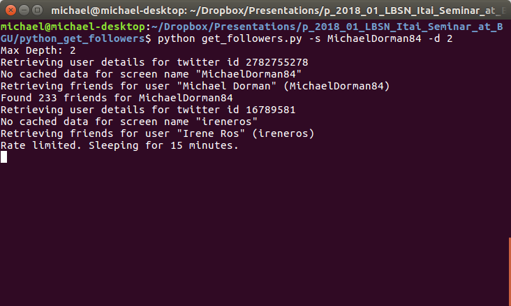
get_followers.py Python script for reconstructing social network of given depth around a given userThe resulting folder of user-metadata processed into a CSV ile with another Python script:
python twitter_network.py
Finally, the processed CSV file can be read into R with pd.read_csv. The table consists of an edge list:
friends = pd.read_csv("data/network.csv", sep = "\t", header=None, usecols=[0, 1], names=["from", "to"])
friends
| from | to | |
|---|---|---|
| 0 | MichaelDorman84 | ireneros |
| 1 | ireneros | fdo_becerra |
| 2 | ireneros | KAUST_Vislab |
| ... | ... | ... |
| 86855 | therealguypines | guyoseary |
| 86856 | therealguypines | RyanSeacrest |
| 86857 | therealguypines | TheEllenShow |
86858 rows × 2 columns
We can remove users for whom we have no friend data. That way, the social network ties between the remaining users are fully described:
sel = friends["to"].isin(friends["from"])
friends = friends[sel].reset_index(drop=True)
friends
| from | to | |
|---|---|---|
| 0 | MichaelDorman84 | ireneros |
| 1 | ireneros | juliasilge |
| 2 | juliasilge | jtleek |
| ... | ... | ... |
| 3832 | NOAAResearch | NOAASatellites |
| 3833 | NOAAResearch | USGS |
| 3834 | NOAAResearch | NOAA |
3835 rows × 2 columns
The python script also produces user details, including self-reported location:
locations = pd.read_csv("data/locations.csv")
locations
| user | address | |
|---|---|---|
| 0 | d3visualization | Montreal |
| 1 | sckottie | OR |
| 2 | mdsumner | Hobart, Tasmania |
| ... | ... | ... |
| 188 | clavitolo | Reading, United Kingdom |
| 189 | noamross | Brooklyn/Hudson Yards, NY |
| 190 | locweb | Perth, Western Australia |
191 rows × 2 columns
We can use a geocoding service to convert location text to coordinates. The following expression uses the free Nominatim geocoding service based on OpenStreetMap data, accessed through geopandas:
# gcp = gpd.tools.geocode(locations["address"], provider="nominatim", user_agent="michael", timeout=4)
# gcp["address"] = locations["address"]
# gcp = gcp.drop_duplicates()
# gcp.to_file("data/gcp.shp")
gcp = gpd.read_file("data/gcp.shp")
gcp
| address | geometry | |
|---|---|---|
| 0 | Montreal | POINT (-73.56981 45.50318) |
| 1 | OR | POINT (-120.73726 43.97928) |
| 2 | Hobart, Tasmania | POINT (147.32812 -42.88251) |
| ... | ... | ... |
| 146 | Reading, United Kingdom | POINT (-0.96965 51.45666) |
| 147 | Brooklyn/Hudson Yards, NY | POINT (-73.99645 40.75608) |
| 148 | Perth, Western Australia | POINT (115.86058 -31.95590) |
149 rows × 2 columns
To get the country name for each user location, we can use the world borders polygonal layer available as a built-in dataset in geopandas:
world = gpd.read_file(gpd.datasets.get_path("naturalearth_lowres"))
world = world[["name", "geometry"]]
world.plot();
<matplotlib.axes._subplots.AxesSubplot at 0x7fac4e45ffd0>

Here is a map of:
world—World countriesworld.intersects(gcp.unary_union)—World countries coinciding with Twitter user locationsgcp—Geocoded Twitter user locationsbase = world.plot(color="None", edgecolor="grey")
world[world.intersects(gcp.unary_union)].plot(ax=base, color="grey", edgecolor="black")
gcp.plot(ax=base, color="red");
<matplotlib.axes._subplots.AxesSubplot at 0x7fac4f7c4250>

We can add the country each user location falls in with a spatial join. First, we use a spatial join to detect the country name where each geocoded address "falls in":
gcp = gpd.sjoin(gcp, world, how="left")
gcp
| address | geometry | index_right | name | |
|---|---|---|---|---|
| 0 | Montreal | POINT (-73.56981 45.50318) | 3.0 | Canada |
| 1 | OR | POINT (-120.73726 43.97928) | 4.0 | United States of America |
| 2 | Hobart, Tasmania | POINT (147.32812 -42.88251) | 137.0 | Australia |
| ... | ... | ... | ... | ... |
| 146 | Reading, United Kingdom | POINT (-0.96965 51.45666) | 143.0 | United Kingdom |
| 147 | Brooklyn/Hudson Yards, NY | POINT (-73.99645 40.75608) | 4.0 | United States of America |
| 148 | Perth, Western Australia | POINT (115.86058 -31.95590) | 137.0 | Australia |
149 rows × 4 columns
Then, we use an ordinary join attach those country names back to the Twitter users list. That way, in the locations table, we now have user+country instead of user+address:
locations = pd.merge(locations, gcp[["address", "name"]], how="left").drop(["address"], axis=1)
locations
| user | name | |
|---|---|---|
| 0 | d3visualization | Canada |
| 1 | sckottie | United States of America |
| 2 | mdsumner | Australia |
| ... | ... | ... |
| 188 | clavitolo | United Kingdom |
| 189 | noamross | United States of America |
| 190 | locweb | Australia |
191 rows × 2 columns
Now we can replace all user names in the "edge list" table with the corresponding country names:
friends = friends.rename(columns={"from":"user"}).merge(locations, how="inner").rename(columns={"name":"from"}).drop(["user"], axis=1)
friends = friends.rename(columns={"to":"user"}).merge(locations, how="inner").rename(columns={"name":"to"}).drop(["user"], axis=1)
friends
| from | to | |
|---|---|---|
| 0 | Israel | United States of America |
| 1 | United States of America | United States of America |
| 2 | United Kingdom | United States of America |
| ... | ... | ... |
| 3832 | United States of America | Israel |
| 3833 | Israel | Israel |
| 3834 | United States of America | Israel |
3835 rows × 2 columns
Then, remove missing values:
friends = friends.dropna().copy()
friends
| from | to | |
|---|---|---|
| 0 | Israel | United States of America |
| 1 | United States of America | United States of America |
| 2 | United Kingdom | United States of America |
| ... | ... | ... |
| 3832 | United States of America | Israel |
| 3833 | Israel | Israel |
| 3834 | United States of America | Israel |
2835 rows × 2 columns
and count:
friends["count"] = 1
friends = friends.groupby(["from", "to"]).sum().reset_index()
friends
| from | to | count | |
|---|---|---|---|
| 0 | Australia | Australia | 8 |
| 1 | Australia | Austria | 5 |
| 2 | Australia | Belgium | 1 |
| ... | ... | ... | ... |
| 261 | Venezuela | Tanzania | 1 |
| 262 | Venezuela | Ukraine | 1 |
| 263 | Venezuela | United States of America | 8 |
264 rows × 3 columns
The result is a country-to-country edge list.
To benefit from methods for visualization and analysis of networks we need to convert the edge list table to a network object. We use function from_pandas_edgelist from package networkx:
G = nx.from_pandas_edgelist(friends, "from", "to", create_using=nx.DiGraph(), edge_attr="count")
G
<networkx.classes.digraph.DiGraph at 0x7fac4ab9c700>
A network object basically contains two components:
In our case the nodes are countries:
list(G.nodes)
['Australia',
 'Austria',
 'Belgium',
 'Canada',
 'Denmark',
 'France',
 'Germany',
 'Ireland',
 'Italy',
 'Netherlands',
 'New Zealand',
 'Romania',
 'Spain',
 'Switzerland',
 'Tanzania',
 'Ukraine',
 'United Kingdom',
 'United States of America',
 'Finland',
 'Japan',
 'Venezuela',
 'India',
 'Thailand',
 'Israel',
 'China']
len(list(G.nodes))
25
and the edges are follower ties between users of those countries, weighted according to the number of ties ("count"):
list(G.edges.data())[:10]
[('Australia', 'Australia', {'count': 8}),
 ('Australia', 'Austria', {'count': 5}),
 ('Australia', 'Belgium', {'count': 1}),
 ('Australia', 'Canada', {'count': 6}),
 ('Australia', 'Denmark', {'count': 1}),
 ('Australia', 'France', {'count': 5}),
 ('Australia', 'Germany', {'count': 6}),
 ('Australia', 'Ireland', {'count': 1}),
 ('Australia', 'Italy', {'count': 1}),
 ('Australia', 'Netherlands', {'count': 4})]
len(list(G.edges))
264
The network can be visualized using function nx.draw. We are using one of the built-in algorithms (.kamada_kawai_layout) to calculate an optimal visual arrangement of the nodes:
pos = nx.kamada_kawai_layout(G)
nx.draw(G, pos, with_labels=True)

To reflect the edge weights, we can use the width parameter of a network plot:
weights = nx.get_edge_attributes(G,"count").values()
weights = list(weights)
weights[:10]
[8, 5, 1, 6, 1, 5, 6, 1, 1, 4]
pos = nx.kamada_kawai_layout(G)
nx.draw(G, pos, with_labels=True, width=[i/50 for i in weights])

Let us calculate two basic graph properties:
nx.density(G)
0.44
nx.number_connected_components(G.to_undirected())
1
Since G is a spatial network (where vertices represent locations), it may be more natural to display in a spatial layout. To do that, we first have to attach x/y coordinates to each vertex. We use the country centroids. Here is how we can get centroid coordinates of one specific country:
i = list(G.nodes)[0]
i
'Australia'
list(world[world["name"] == i]["geometry"].iloc[0].centroid.coords)
[(134.50277547536595, -25.730654779726077)]
and here is how we get all coordinates at once, into a dict named pos:
pos = [list(world[world["name"] == i]["geometry"].iloc[0].centroid.coords)[0] for i in list(G.nodes)]
pos = dict(zip(list(G.nodes), pos))
pos
{'Australia': (134.50277547536595, -25.730654779726077),
 'Austria': (14.076158884337072, 47.6139487927463),
 'Belgium': (4.580834113854935, 50.65244095902296),
 'Canada': (-98.14238137209708, 61.46907614534896),
 'Denmark': (9.876372937675002, 56.06393446179454),
 'France': (-2.8766966992706267, 42.46070432663372),
 'Germany': (10.288485092742851, 51.13372269040778),
 'Ireland': (-8.010236544877012, 53.18059120995006),
 'Italy': (12.140788372235871, 42.751183052964265),
 'Netherlands': (5.512217100965399, 52.298700374441786),
 'New Zealand': (172.70192594405574, -41.662578757158684),
 'Romania': (24.943252494635377, 45.857101035738005),
 'Spain': (-3.6170206023873743, 40.348656106226734),
 'Switzerland': (8.118300613385486, 46.79173768366762),
 'Tanzania': (34.75298985475595, -6.257732428506092),
 'Ukraine': (31.229122070266495, 49.14882260840351),
 'United Kingdom': (-2.8531353951805545, 53.91477348053706),
 'United States of America': (-112.5994359115045, 45.70562800215178),
 'Finland': (26.211764610296353, 64.50409403963651),
 'Japan': (138.06496213270776, 37.66311081170466),
 'Venezuela': (-66.16382727830238, 7.162132267639002),
 'India': (79.59370376325381, 22.92500640740852),
 'Thailand': (101.00613354626108, 15.01697499141648),
 'Israel': (35.003851206429005, 31.4849193900197),
 'China': (103.88361230063249, 36.555066531858685)}
which can be passed to nx.draw:
base = world.plot(color="None", edgecolor="lightgrey")
nx.draw(G, pos, ax=base, with_labels=True, width=[i/50 for i in weights])

Node degree is the number of edges adjacent to the node, or, in a weighted network, the sum of the edge weights for that node:
d = G.degree(weight="count")
d
DiDegreeView({'Australia': 180, 'Austria': 104, 'Belgium': 27, 'Canada': 294, 'Denmark': 83, 'France': 266, 'Germany': 237, 'Ireland': 39, 'Italy': 28, 'Netherlands': 125, 'New Zealand': 55, 'Romania': 26, 'Spain': 99, 'Switzerland': 52, 'Tanzania': 38, 'Ukraine': 28, 'United Kingdom': 796, 'United States of America': 2864, 'Finland': 29, 'Japan': 6, 'Venezuela': 42, 'India': 14, 'Thailand': 16, 'Israel': 221, 'China': 1})
sizes = list(dict(d).values())
base = world.plot(color="None", edgecolor="lightgrey")
nx.draw(G, pos, ax=base, with_labels=True, width=[i/50 for i in weights], node_size=sizes)

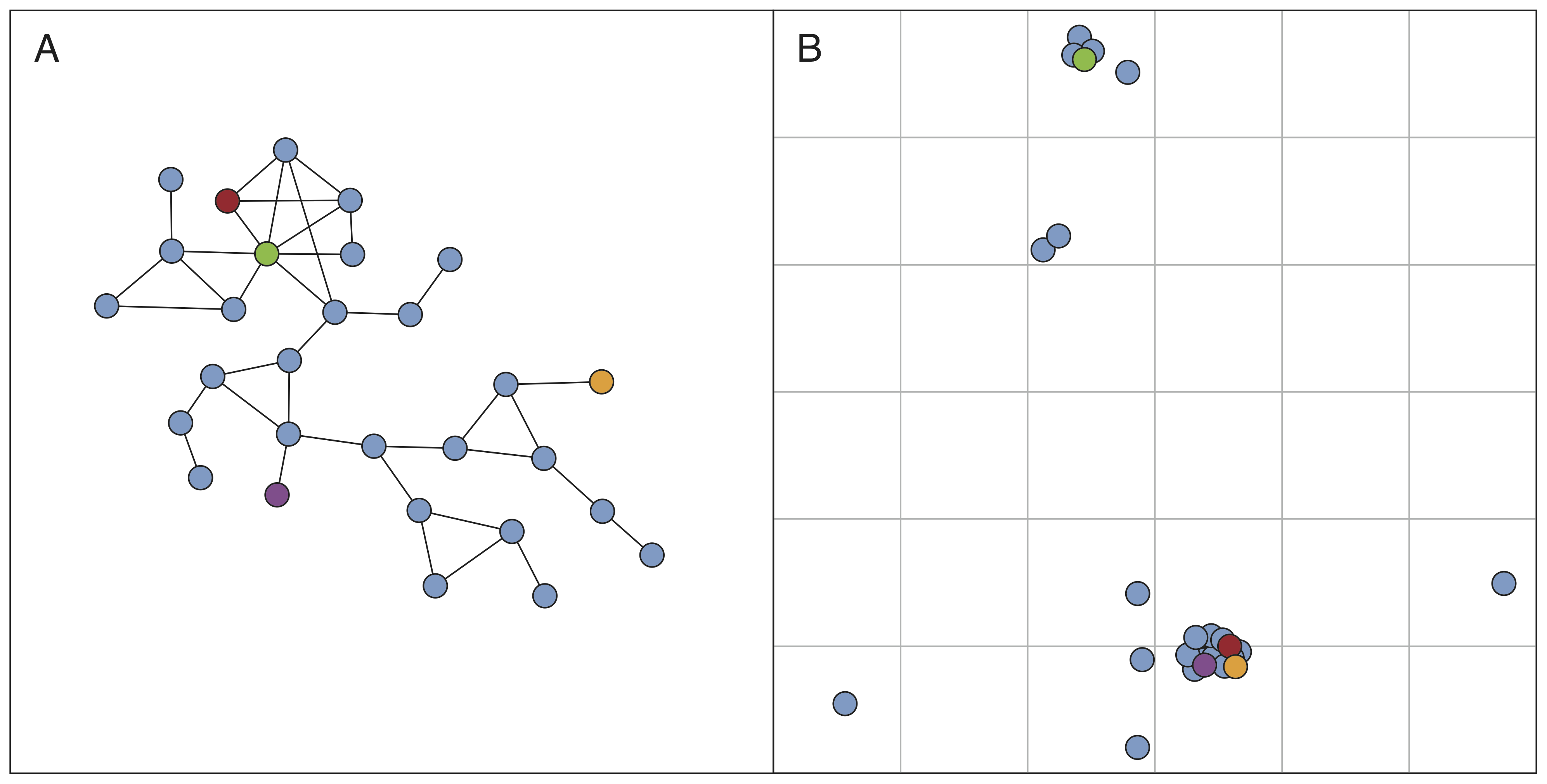
Community detection algorithms aim at identifying sub-groups in a network. A sub-group is a set of nodes that has a relatively large number of internal ties, and also relatively few ties from the group to other parts of the network.
list(networkx.algorithms.community.greedy_modularity_communities(G))
[frozenset({'Australia',
            'Canada',
            'Denmark',
            'France',
            'Germany',
            'Ireland',
            'New Zealand',
            'Spain',
            'Switzerland',
            'United Kingdom'}),
 frozenset({'China',
            'Finland',
            'India',
            'Israel',
            'Thailand',
            'Ukraine',
            'United States of America',
            'Venezuela'}),
 frozenset({'Austria',
            'Belgium',
            'Italy',
            'Japan',
            'Netherlands',
            'Romania',
            'Tanzania'})]


textblob:text = [
"I'm happy",
"I'm sad...",
"I'm very happy!",
"I'm not happy"
]
[(i, textblob.TextBlob(i).sentiment.polarity) for i in text]
[("I'm happy", 0.8),
 ("I'm sad...", -0.5),
 ("I'm very happy!", 1.0),
 ("I'm not happy", -0.4)]
Before calculating polarity of the tweets sample, we need to keep only those in English:
pnt1 = pnt[pnt["lang"] == "en"].copy()
pnt1
| index | created_at | user | text | ... | index_right | NAME_0 | NAME_1 | NAME_2 | |
|---|---|---|---|---|---|---|---|---|---|
| 0 | 1 | 2022-03-10 17:00:03-05:00 | 5oclockbot | It's 5 o'clock in Marblehead. | ... | 7 | United States | Massachusetts | Essex |
| 18 | 19 | 2022-03-10 17:03:37-05:00 | MO_DAVINCI | Spring is in the air. 🌼 🌸 🌻 🌹 @... | ... | 7 | United States | Massachusetts | Essex |
| 59 | 60 | 2022-03-10 17:25:41-05:00 | tmj_BOS_schn | Want to land a job like "Delive... | ... | 7 | United States | Massachusetts | Essex |
| ... | ... | ... | ... | ... | ... | ... | ... | ... | ... |
| 1672 | 1673 | 2022-03-11 16:19:24-05:00 | SperryCareers | We're hiring! Click to apply: S... | ... | 3 | United States | Maine | York |
| 1107 | 1108 | 2022-03-11 12:15:28-05:00 | tmj_MA_transp | Want to work at FedEx Express? ... | ... | 11 | United States | Massachusetts | Nantucket |
| 1386 | 1387 | 2022-03-11 14:07:33-05:00 | SOTAwatch | 19:07 WC1N (Robert) on W1/HA-00... | ... | 17 | United States | New Hampshire | Cheshire |
1094 rows × 11 columns
Then we can calculate polarity and place it in a new polarity column:
pnt1["polarity"] = [textblob.TextBlob(i).sentiment.polarity for i in pnt1["text"]]
pnt1
| index | created_at | user | text | ... | NAME_0 | NAME_1 | NAME_2 | polarity | |
|---|---|---|---|---|---|---|---|---|---|
| 0 | 1 | 2022-03-10 17:00:03-05:00 | 5oclockbot | It's 5 o'clock in Marblehead. | ... | United States | Massachusetts | Essex | 0.00 |
| 18 | 19 | 2022-03-10 17:03:37-05:00 | MO_DAVINCI | Spring is in the air. 🌼 🌸 🌻 🌹 @... | ... | United States | Massachusetts | Essex | 0.00 |
| 59 | 60 | 2022-03-10 17:25:41-05:00 | tmj_BOS_schn | Want to land a job like "Delive... | ... | United States | Massachusetts | Essex | 0.00 |
| ... | ... | ... | ... | ... | ... | ... | ... | ... | ... |
| 1672 | 1673 | 2022-03-11 16:19:24-05:00 | SperryCareers | We're hiring! Click to apply: S... | ... | United States | Maine | York | 0.00 |
| 1107 | 1108 | 2022-03-11 12:15:28-05:00 | tmj_MA_transp | Want to work at FedEx Express? ... | ... | United States | Massachusetts | Nantucket | 0.00 |
| 1386 | 1387 | 2022-03-11 14:07:33-05:00 | SOTAwatch | 19:07 WC1N (Robert) on W1/HA-00... | ... | United States | New Hampshire | Cheshire | -0.75 |
1094 rows × 12 columns
Here are the five most negative tweets:
pnt1[["text", "polarity"]].sort_values(by="polarity").head()["text"].tolist()
['19:07 WC1N (Robert) on W1/HA-009 (Monadnock Mountain, 967m, 4 pts) 14.0590 CW: [RBNHole] at KM3T 18 WPM 3 dB SNR [RBNHOLE]',
 'Tobias Harris has the worst contract in the league. God damn he sucks.',
 'Random #bunkerhill timelapse clip of the day! #charlestown #boston @bostonNHP https://t.co/qf3n1NGtW7',
 'Random #southie timelapse clip of the day! #boston #dorchesterheights @bostonNHP https://t.co/uxOnUU7QZW',
 'Just posted a photo @ Cold Harbor Brewing Company https://t.co/kf7QG5cOsi']
and the five most positive tweets:
pnt1[["text", "polarity"]].sort_values(by="polarity", ascending=False).head()["text"].tolist()
['The great Max Jordan turns 18 today!\nMiraculous! @ Providence, Rhode Island https://t.co/p2DXNrRKDU',
 'Career tip for landing jobs like "Sanitation" in #Braintree, MA. Go on informational interviews. The best way to ge… https://t.co/XPqLodsb7B',
 'Excellent flavor. - Drinking a Letter To Robert Fripp by @CamBrewingCo at @cambridgebrewer  — https://t.co/tR4VtNBBHg',
 'At Hawthorn Senior Living we care about people and because our residents deserve the best. If you are someone who u… https://t.co/XUxU1vfI9H',
 'Our delicious FIsh Stew tonight. #fishstew #fishfriday #fishandchips #bakedschrod #grilledsalmon  #allovernewton… https://t.co/wMDs5Nz2x1']
We can also examine the spatial pattern of tweet polarity using a map:
pnt1.plot(column="polarity", legend=True);
<matplotlib.axes._subplots.AxesSubplot at 0x7fac40e28430>


twarctweepyshapelygeopandasnetworkxtextblob