Chapter 8 Symbology and Interactivity
Last updated: 2024-07-21 15:48:12
8.1 Introduction
Styling of map features lets us convey quantitative or qualitative information (how many residents are in that polygon?) or emphasis for drawing viewer attention (where is the border of the particular polygon of interest?). The way that aesthetic properties of map features are associated with underlying data or meaning is collectively known as map symbology, an essential concept of mapping in general, and web mapping in particular.
In Chapter 7, we learned about how GeoJSON layers can be added on a web map, whether from an object defined in the JavaScript environment (Section 7.5), a local file (Section 7.8.1), or a remote file (Section 7.8.2). As for style, however, all of the layers’ features were drawn the same way. That is, because all features were set with the same default settings for their various aesthetic properties, such as fill color, line width, etc.
In addition to map symbology, web maps usually also express interactive behavior to further enhance user experience and convey even more information. Interactive behavior is what really sets interactive maps apart from static maps, such as those printed on paper or contained in image files and PDF documents. For example, an interactive map may have controls for turning overlaid layers on or off, switching between different base maps, displaying popups with textual or multimedia content for each clicked feature, highlighting elements on mouse hover, and so on.
In this chapter, we concentrate on defining map symbology (Sections 8.3–8.4) along with a corresponding legend (Section 8.6–8.6.2), by setting the style of our GeoJSON layers displayed on the map, and interactive behavior, by setting custom popups (Section 8.5), dynamic styling (Section 8.7.1), and dynamic information boxes (Section 8.7.2).
8.2 L.geoJSON options
As shown in Section 7.5, the L.geoJSON function accepts a GeoJSON object and turns it into a GeoJSON layer, which can be displayed on a Leaflet map. Additionally, the L.geoJSON function can accept a number of options that we have not used yet. These options may be used to specify styling, filtering, attaching event listeners or popups, and otherwise controlling the display and functionality of the individual features comprising the GeoJSON layer. In this chapter, we use the following two options to enhance our GeoJSON layers:
style—Determines layer style. Thestylecan be either an object to style all features the same way (Section 8.3), or a function to style features based on their properties (Section 8.4).onEachFeature—A function that gets called on each feature before adding it to the GeoJSON layer. TheonEachFeaturefunction can be used to add specific popups (Section 8.5) or event listeners (Section 8.7.1) to each feature.
When using both options, the L.geoJSON function call may look like this:
where:
geojsonis the GeoJSON object; and{style: ..., onEachFeature: ...}is the options object, in this case including bothstyleandonEachFeatureoptions.
The ... parts in the above expression are to be replaced with an object or a function (see below), depending on how we want to define the appearance and behavior of the GeoJSON layer.
In addition to style and onEachFeature, in Exercise 07 (Section 7.9) we mentioned a third option of L.geoJSON called pointToLayer. The pointToLayer option determines the way that GeoJSON point geometries are translated to visual layers. The pointToLayer option can be used to determine whether a GeoJSON "Point" feature should be displayed using a marker (Figure 7.10; the default), a circle marker (Figure 7.12), or a circle. For example, the following setting can be used to draw circle markers (instead of markers) for GeoJSON points:
8.3 Constant style
The simplest way to style our GeoJSON layer is to set constant aesthetic properties for all of the features it contains. Just like in styling of line (Sections 6.6.3) and polygon (Section 6.6.4) layers, we only need to set those specific properties where we would like to override the default appearance. For example, let’s start with example-07-01.html from Section 7.5. In that example, we used the following expression to add the GeoJSON object named states to our map:
This sets the default Leaflet style for all polygons—blue border and semi-transparent blue fill (Figure 7.4). To override some of the default settings, the above expression can be replaced with the following one:
L.geoJSON(states, {
    style: {
        color: "red",
        weight: 5,
        fillColor: "yellow",
        fillOpacity: 0.2
    }
}).addTo(map);
In the new version, we are passing an object of options to the L.geoJSON function. The object contains one property named style, for which the value is also an object, containing the style specifications. In this example, we use four specifications:
color:"red"—Border color = redweight:5—Border width = 5pxfillColor:"yellow"—Fill color = yellowfillOpacity:0.2—Fill opacity = 20% opaque
The resulting map example-08-01.html is shown in Figure 8.1.
FIGURE 8.1: example-08-01.html (Click to view this example on its own)
The path options being set in this example—border width, border color, fill color, and opacity levels—are the most commonly used ones. Other options include line cap and join styles (lineCap, lineJoin) and line dash types (dashArray, dashOffset).
8.4 Varying style
8.4.1 Setting varying style
In case we want the style to vary according to the properties of each feature, we need to pass a function instead of an object (Section 8.3), to the style option of L.geoJSON. We will demonstrate varying GeoJSON style through two examples: using the states GeoJSON object (Section 8.4.2) and the 'stat.geojson' file (Section 8.4.3).
8.4.2 States example
The GeoJSON object named states, which we used in the last example (Section 8.3), has an attribute named party with two possible values: "Republican" and "Democrat". To color the state polygons according to party, we need to write a function that sets feature style according to its properties. The function takes an argument feature, which refers the current GeoJSON feature, and returns the style object for that particular feature.
In the following example, the styling function, named states_style, returns an object with four properties. Three out of the four properties are set to constant values (color, weight, fillOpacity). The fourth property (fillColor) is variable. The fillColor property is dependent on the party attribute of the current feature (feature.properties.party):
function states_style(feature) {
    return {
        color: 'black',
        weight: 1,
        fillColor: states_color(feature.properties.party),
        fillOpacity: 0.7
    };
}
The association between the party attribute and the fill color is made through the states_color function, separately defined below. The states_color function takes a party name p and returns a color name. The function uses if/else conditionals (Section 3.10.2):
function states_color(p) {
    if(p === 'Republican') return 'red';
    if(p === 'Democrat') return 'blue';
    return 'grey';
}
The code of the states_color function specifies that if the value of p is 'Republican' the function returns 'red', and if the value of p is 'Democrat', the function returns 'blue'. If any other value is encountered, the function returns the default color 'grey'.
Finally, we can use the states_style function as the style option when creating the states layer and adding it on the map:
The resulting map example-08-02.html is shown in Figure 8.2. Note that polygon fill color is now varying: one of the polygons is red while the other one is blue.
FIGURE 8.2: example-08-02.html (Click to view this example on its own)
8.4.3 Statistical areas example
As another example, we will modify the style of polygons in the Israel statistical areas map, which we prepared in example-07-03.html (Figure 7.9). The statistical areas layer in the 'stat.geojson' file contains an attribute named density, which gives the population density estimate per town in 2020. We will use the density attribute to set polygon fill color reflecting the population density of each town (Figure 8.5).
First, we need to define a function that can accept an attribute value and return a color, just like the states_color function from the states example (Section 8.4.2). Since the density attribute is a continuous variable, our function will operate using breaks to divide the continuous distribution into categories. Each of the categories will be associated with a different color. The break points, along with the respective colors, comprise the layer symbology.
How can we choose the appropriate breaks when classifying a continuous distribution into a set of discrete categories? There are several commonly used methods for doing that. The simplest method, appropriate when the distribution is roughly uniform, is a linear scale. In a linear scale, break points are evenly distributed. For example, in case our values are between 0 and 1000, break points for a linear scale with five colors may be defined using the following array:
Note that there are just three intervals between these values (200–400, 400–600, and 600–800), with the <200 and >800 ranges contributing the remaining two intervals. To emphasize this fact, we could explicitly specify the minimum and maximum values of the distribution (such as 0 and 1000), or just specify -Infinity and Infinity:
When the distribution of the variable of interest is skewed, a linear scale may be inappropriate, as it would lead to some of the colors being much more common than others. As a result, the map may have little color diversity and appear uniformly colored. One solution is to use a logarithmic scale, such as:
The logarithmic scale gives increasingly detailed emphasis on one side of the distribution—the smaller values—by inducing increasingly wider categories. For example, the first category (1–10) is much narrower than the last category (100–1000).
A more flexible way of dealing with non-uniform distributions, which we are going to demonstrate in the present example, is using quantiles. Quantiles are break points that distribute our set of observations into groups with equal counts of cases. For example, using quantiles we may divide our distribution into four equal groups, each containing a quarter of all values (0%–25%–50%–75%–100%)75. There are advantages and disadvantages to using quantile breaks in mapping. The major advantage is that all colors are equally represented, which makes it easy to detect ordinal spatial patterns in our data. The downside is that category ranges can be widely different, in a non-systematic manner, which means that different color “steps” on the map are not consistently related to quantitative differences.
How can we calculate the quantile breaks for a given variable? There are many ways to calculate the break points in various software and programming languages, including in JavaScript. One example of an external software to calculate quantiles is QGIS (QGIS Development Team 2018). Once the layer of interest (such as 'stat.geojson') is loaded in QGIS, we need to set its symbology choosing the Quantile (Equal Count) for Mode, as shown in Figure 8.3. We also need to choose how many quantiles we want. For example, choosing 5 means that our values are divided into 5 equally sized groups, each containing 20% of the observations (i.e., 0%–20%–40%–60%–80%–100%). The breaks will be automatically calculated and displayed (Figure 8.3).
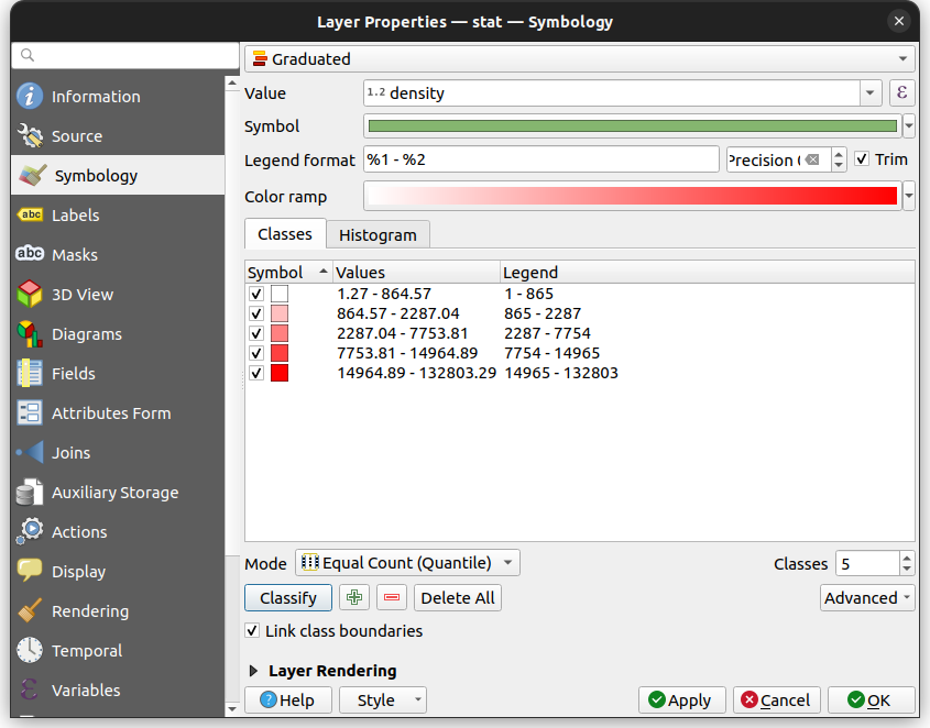
FIGURE 8.3: Setting symbology in QGIS, with automatically determined color scale breaks
The four break points to split the density variable into five quantiles are given in the following array (Figure 8.3):
As one more alternative, the breaks can be calculated using R and package sf, as follows:
library(sf)
dat = st_read('data/stat.geojson', quiet = TRUE)
round(quantile(dat$density, seq(0, 1, by = 0.2)))
## 0% 20% 40% 60% 80% 100%
## 1 865 2287 7754 14965 132803Once we figured out the break points, we can write a color-selection function, such as the one hereby named stat_color. The function accepts a value d (population size) and determines the appropriate color for that value. Since we have five different categories, the function uses a hierarchical set of four conditionals, as follows:
function stat_color(d) {
    if(d > 14965) return "...";
    if(d > 7754) return "...";
    if(d > 2287) return "...";
    if(d > 865) return "...";
    return "...";
}
What’s missing in the body of the above function ("...") are the color definitions. As discussed in Section 2.8.2, there are several ways to specify colors with CSS. We can use RBG or RGBA values, HEX codes, or color names to specify colors in Leaflet. All of these methods are supported in Leaflet, too.
How can we pick the right set of five colors for our color scale? It may be tempting to pick the colors manually, but this may lead to an inconsistent color gradient. It is therefore best to use automatic tools and resources rather than try to pick the colors ourselves. There are many resources on the web and in software packages available for the job. One of the best and most well-known ones is ColorBrewer. The ColorBrewer website provides a collection of carefully selected color scales, specifically designed for cartography by Cynthia Brewer (Figure 8.4). Conveniently, you can choose the color palette, and how many colors to pick from it, then export the HEX codes of all colors in several formats, including a JavaScript array. ColorBrewer provides three types of scales:
- Sequential scales
- Diverging scales
- Qualitative scales
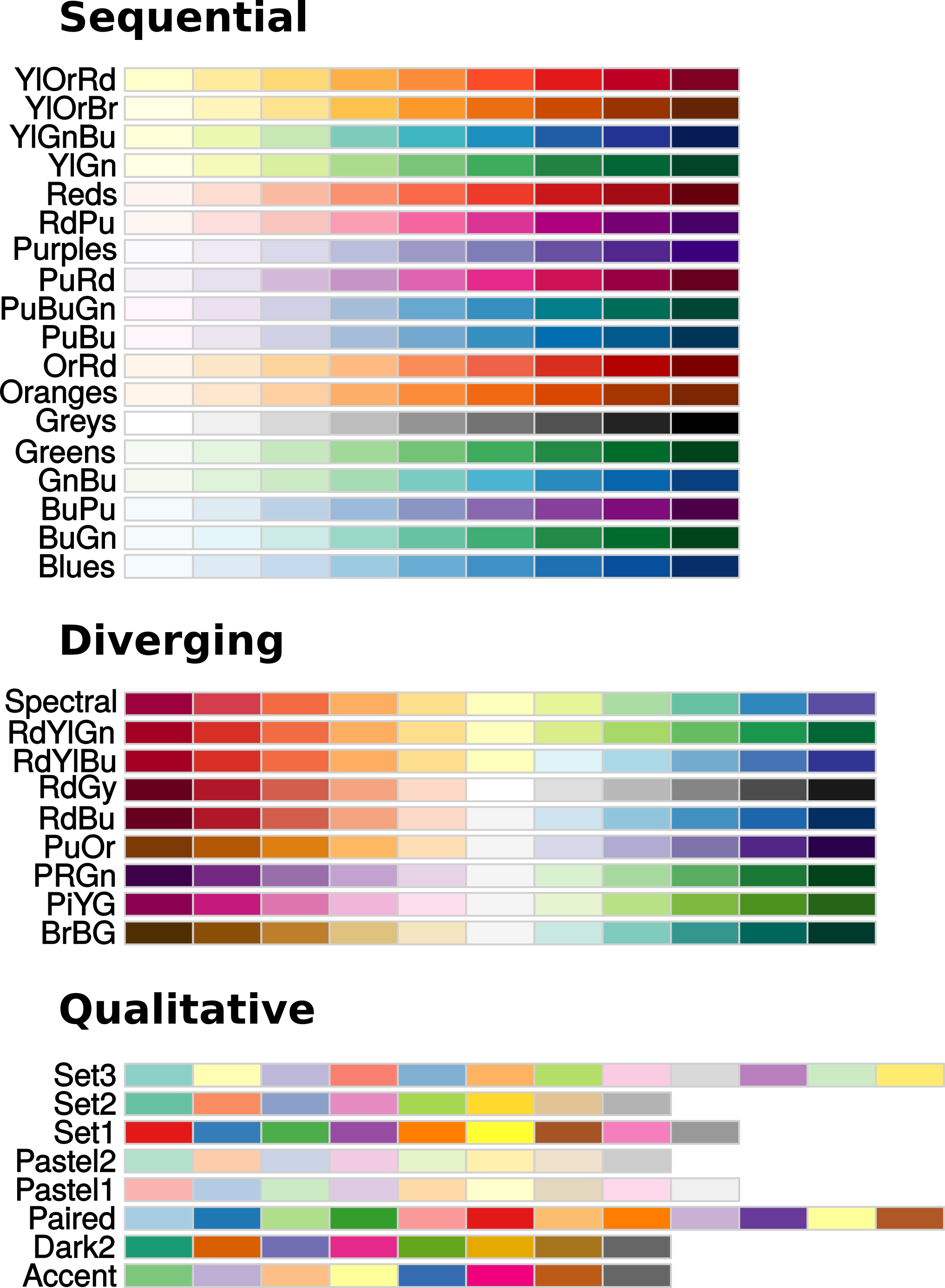
FIGURE 8.4: Sequential, diverging, and qualitative ColorBrewer scales, using the maximal number of colors available in each scale
For our population size data, we will use a sequential scale (Figure 8.4), which is appropriate when the data are continuous and have a single direction (low-high). Diverging scales are appropriate for continuous variables that diverge in two directions around some kind of “middle”, typically at zero (e.g., negative-zero-positive). For example, rate of population growth can be mapped with a diverging scale, where positive and negative growth rates are shown with different increasingly dark colors (e.g., red and blue), while values around zero are shown with a light color (e.g., white). Qualitative scales are appropriate for categorical variables that have no inherent order, mapped to an easily distinguishable set of colors. For instance, land cover categories (e.g., built area, forests, water bodies, etc.) can be mapped to a qualitative scale76.
To export a JavaScript array of HEX color codes from ColorBrewer:
- Go to http://colorbrewer2.org.
- Select the Number of data classes (e.g., 5).
- Pick the Nature of your data, i.e., the scale type (e.g., “sequential”).
- Select the scale in the Pick a color scheme menu (e.g., “OrRd” for an Orange-Red scale).
- Click Export and copy the contents of the text box named JavaScript.
For example, choosing five colors from the sequential color scheme called “OrRd” (Orange-Red), the ColorBrewer website gives us the following set of HEX color codes:
This is an expression for creating a JavaScript array, which we can copy and paste directly into our JavaScript code. The ColorBrewer website also contains a JavaScript code file named colorbrewer.js, with the complete set of color palette definitions as JavaScript arrays. If you use many different scales in a particular web map, it may be a good idea to include the file in your web page and then refer to the various color scale arrays by name in your JavaScript code.
Now that we have the five color codes, let’s insert them into the stat_color function definition. The function accepts a population size d, and returns the corresponding color code:
function stat_color(d) {
    if(d > 14965) return "#b30000";
    if(d > 7754) return "#e34a33";
    if(d > 2287) return "#fc8d59";
    if(d > 865) return "#fdcc8a";
    return "#fef0d9";
}
One disadvantage of the above stat_color function definition is that it uses a rigid set of if/else conditionals, which will be inconvenient to modify in case we decide to change the number of break points and colors. A more general version of the function could operate on an array of break points and a corresponding array of colors. Then, instead of if/else conditionals the function could use a for loop (Section 3.10.3.1). The loop goes over the breaks array, detects between which pair of breaks our value is situated, and returns the appropriate color. Here is an alternative version of the stat_color function, using a for loop instead of if/else conditionals:
let breaks = [-Infinity, 865, 2287, 7754, 14965, Infinity];
let colors = ["#fef0d9", "#fdcc8a", "#fc8d59", "#e34a33", "#b30000"];

function stat_color(d) {
    for(let i = 0; i < breaks.length; i++) {
        if(d > breaks[i] && d <= breaks[i+1]) {
            return colors[i];
        }
    }
}
With this version, it is easier to replace the color scale whenever necessary. All we need to do is modify the breaks and colors arrays.
Like in the states example (example-08-02.html), our next step is to wrap the stat_color function into another function, hereby named stat_style, which is responsible for setting all of the styling options where we override the defaults:
function stat_style(feature) {
    return {
        fillColor: stat_color(feature.properties.density),
        weight: 0.5,
        opacity: 1,
        color: "black",
        fillOpacity: 0.7
    };
}
This time, we have four constant properties (weight, opacity, color, and fillOpacity) and one variable property (fillColor). Finally, we need to pass the stat_style function to the GeoJSON style option when loading the statistical areas layer (Section 7.8.1) and adding it on the map:
fetch("data/stat.geojson")
    .then(function(response) {
        return response.json();
    })
    .then(function(data) {
        L.geoJSON(data, {style: stat_style}).addTo(map);
    });
The resulting map example-08-03.html is shown in Figure 8.5. The statistical areas polygons are now filled with one of the five colors from the Orange-Red ColorBrewer scale, according to the town popupation size, as defined in the stat_color function.
FIGURE 8.5: example-08-03.html (Click to view this example on its own)
There is a lot of theory and considerations behind choosing the type of symbology and color scale for a map, which we barely scratched the surface of. While we mainly focused on the technical process of defining and applying a color scale in a web map, the reader is referred to textbooks on cartography (Dent, Torguson, and Hodler 2008) and data visualization (Tufte 2001; Wilke 2019) for more information on the theoretical considerations of choosing a color scale for particular types of data and display purposes.
8.5 Constructing popups from data
In Section 6.7, we introduced the .bindPopup method for adding popups to simple shapes, such as the popup for the line between the Aranne Library and the Geography Department in example-06-06.html (Figure 6.11). We could do the same with a GeoJSON layer to bind the same popup to all features. However, it usually doesn’t make much sense for all features (e.g., statistical area polygons) to share the same popup. Instead, we usually want to add specific popups per feature, where each popup conveys information about the respective feature where it is binded. For example, it makes sense for the popup of each statistical area polygon to display its ID, the name of the town where it is located, and its population size or population density.
To bind specific popups, we use another option of the L.geoJSON options object, called onEachFeature. The onEachFeature option applies a function on each feature when that feature is added to the map. We can use the function to add a popup with specific content, based on the feature properties. The function we supply to onEachFeature has two parameters:
feature—Referring to the current feature of the GeoJSON object being processedlayer—Referring to the layer being added on the map
For example, the onEachFeature function can utilize feature.properties to access the properties of the currently processed feature, then run the layer.bindPopup method to add a corresponding popup for that specific feature on the map. The code below uses the onEachFeature option when loading the stat.geojson file, executing a function that binds a specific popup to each GeoJSON feature:
fetch("data/stat.geojson")
    .then(function(response) {
        return response.json();
    })
    .then(function(data) {
        L.geoJSON(data, {
            style: stat_style,
            onEachFeature: function(feature, layer) {
                layer.bindPopup(feature.properties.SHEM_YISHUV_ENGLISH);
            }
        }).addTo(map);
    });
Note how the L.geoJSON function now gets an options object with two properties:
- The
styleproperty contains the named functionstat_stylewhich was defined above (Section 8.4.3). - The
onEachFeatureproperty contains an anonymous function defined inside the object.
Also note that the previous code section binds a simple popup, with just the town name, using the contents of the SHEM_YISHUV_ENGLISH property. However, as we have seen in Section 6.7, we can construct more complicated popup contents by concatenating several strings along with HTML tags. We can also combine several feature properties in the popup contents, rather than just one. For example, we can put the ID, the town name, and the population density inside the popup of each statistical area, placing them in three separate lines. To do that, we replace the expression shown previously:
with this expanded one:
layer.bindPopup(
    '<div class="popup">' +
    feature.properties.YISHUV_STAT11 + "<br>" +
    feature.properties.SHEM_YISHUV_ENGLISH + "<br>" +
    Math.round(feature.properties.density) + ' km<sup>-2</sup>' +
    '</div>'
);
Now the popups will show:
- the statistical area ID (
YISHUV_STAT11), - the town name (
SHEM_YISHUV_ENGLISH), and - the statistical area population density (
density)
Note that we are using the Math.round function to display rounded population density values. For example:
Additionally, the entire popup contents are encompassed in a <div> element with class="popup". The reason we do that is so that we can apply CSS rules for styling the popup contents. In this example, we just use the text-align property (Section 2.8.3.4) to make the popup text centered:
The resulting map example-08-04.html, now with both variable styling and specific popups per feature, is shown in Figure 8.6.
FIGURE 8.6: example-08-04.html (Click to view this example on its own)
- It is more convenient to read long numbers when they are formatted with commas. For example,
24,704is easier to read than24704.- Use a JavaScript function, such as the following one taken from a StackOverflow question, to format the
densityvalues before including them in the popup.
8.6 Adding a legend
8.6.1 Setting legend contents with L.control
A map legend summarizes the meaning of all of the displayed categories in the map symbology. In Section 6.8, we used the L.control function to add a map description. In this section, we use the same technique to create a legend for our map. The workflow for creating a legend involves creating a custom control with L.control, populating it with HTML that represents the legend components, then styling it with CSS so that the contents appear properly on screen. The following code section does all that, adding a legend to the statistical areas population map from the last example (example-08-04.html):
let legend = L.control({position: "topright"});
legend.onAdd = function() {
    let div = L.DomUtil.create("div", "legend");
    div.innerHTML =
        '<b>Population in 2020</b><br>by statistical area<br>' +
        '<small>Persons/km<sup>2</sup></small><br>' +
        '<div style="background-color: #b30000"></div>14965+<br>' +
        '<div style="background-color: #e34a33"></div>7754 - 14965<br>' +
        '<div style="background-color: #fc8d59"></div>2287 - 7754<br>' +
        '<div style="background-color: #fdcc8a"></div>865 - 2287<br>' +
        '<div style="background-color: #fef0d9"></div>0 - 865<br>';
    return div;
};
legend.addTo(map);
So, what did we do here? First, we created an instance of a custom control object, naming it legend. We used the position option to locate the control in the top-right corner of our map. Next, we used the .onAdd method of the legend control to run a function when the legend is added. The function creates a new <div> in the DOM, giving it a class of "legend". This will let us use CSS to style the entire legend using the .legend selector (Section 8.6.2). We then populate the newly created <div> with HTML by using the .innerHTML method, like we already did in Section 6.8.
Most of the HTML code should be familiar from Chapter 1. One element type which we have not seen yet is <small>, used to create relatively smaller text, which is convenient for displaying the units of measurement (Figure 8.7):
The HTML code of the legend entries uses <div> elements to draw the legend symbols, which are 18px square rectangles. Each symbol is followed by a textual description of the respective category, such as 14965+. The <div> elements are useful in this context thanks to the fact they are colored using inline CSS (Section 2.7.2) and the background-color property (Section 2.8.2.1). The five <div> elements thus reflect the colors corresponding to the layer symbology (Section 8.4.3). For example, here is the HTML code that creates the first colored icon (dark red) in our legend:
After the HTML is appended, the <div> element of the entire legend is returned with return div;. Lastly, the legend is added on the map using the .addTo method.
It is important to note that, in the above code, the legend is generated manually. In other words, the breaks and colors in the legend and in the map symbology (Section 8.4.3) are specified in two separate places in our code. It is up to us to make sure the labels and colors in the map legend indeed correspond to the ones we styled the layer with. A more general approach is to generate the legend programmatically, e.g., using a for loop going through the same breaks and colors arrays which we used when setting map symbology (Section 8.4.3 above). Here is an alternative version of the legend definition using a for loop, and the breaks and colors arrays77 we defined in Section 8.4.3:
legend.onAdd = function() {
    let div = L.DomUtil.create("div", "legend");
    div.innerHTML =
        '<b>Population in 2020</b><br>by statistical area<br>' +
        '<small>Persons/km<sup>2</sup></small><br>';
    for(let i = breaks.length-1; i > 0; i--) {
        div.innerHTML +=
          '<div style="background-color: ' + colors[i-1] + '"></div>' +
          breaks[i-1] + ' - ' + breaks[i] + '<br>';
    }
    return div;
};
With this alternative definition, the layer symbology and the legend are always in sync, since they are dependent on the same breaks and colors arrays. That way, changing the symbology (adding more breaks, changing the colors, etc.) will be automatically reflected both in town polygon colors and legend icon colors.
8.6.2 Using CSS to style the legend
One more thing we need to do regarding our legend is to give it the right placement and appearance, using CSS. The following CSS code is used to style our legend:
.legend {
    padding: 6px 8px;
    background-color: rgba(255,255,255,0.8);
    box-shadow: 0 0 15px rgba(0,0,0,0.2);
    border-radius: 5px;
}
.legend div {
    width: 18px;
    height: 18px;
    float: left;
    margin-right: 8px;
    opacity: 0.7;
}
div.legend.leaflet-control br {
    clear: both;
}
In the first CSS rule, we set properties for the legend as a whole, referring to .legend. We are setting padding, background color, box shadow, and border radius. In the second rule, we set our legend symbols (<div> elements) dimensions and also set float:left; so that the the symbols will be aligned into columns. The float:left; property (Section 7.6.2) ensures that the symbols and the text descriptions for each legend entry are placed together, side by side, on the same line. Finally, the third rule makes sure the legend items are correctly aligned regardless of browser zoom level.
The statistical areas map example-08-05.html, now with a map legend, is shown in Figure 8.7.
FIGURE 8.7: example-08-05.html (Click to view this example on its own)
- Make a local copy of
example-08-05.html.- Replace the code section for defining the
stat_colorfunction, to use aforloop instead ofif/elseconditionals. The alternative code section is given in Section 8.4.3. Don’t forget to add thebreaksandcolorsarray definitions, in addition to theforloop!- Replace the code section for generating HTML contents for the legend, to use a
forloop instead of the fixed HTML string. The alternative code section is given in Section 8.6.- You should see few small differences between the labels of each color category in the legends of
example-08-05.html(Figure 8.7) and your modified version. Can you figure out which parts of the code are responsible for those differences?
8.7 Dynamic style
8.7.1 Styling in response to events
In the previous examples, we learned how to set a constant style, which is the same for all GeoJSON features (Section 8.3), and a variable style, which is dependent on feature properties, such as political party (Section 8.4.2) or population density (Section 8.4.3). In both cases, however, the style was determined on page load and remained the same, regardless of subsequent user interaction with the map. In this section, we will see how styling can also be made dynamic. This means the style can change while the user interacts with the page. For example, a specific feature can be highlighted when the user places the mouse cursor above it (Figure 8.8). Dynamic styling can greatly enhance user experience and is one of the distinctive features of interactive web maps.
To achieve dynamic styling, we need to add event listeners to modify layer style in response to particular events. In the next example, we will add event listeners for changing any feature hovered with the mouse to “highlighted” style. Our event listeners are going to have to respond to "mouseover" and "mouseout" events (Section 4.4), and change the respective feature style to “highlighted” or “normal” state, respectively.
Specific event listeners per feature can be binded when loading the GeoJSON layer using the onEachFeature option, similarly to the way we used it to bind specific popups (Section 8.5). Inside the onEachFeature function, we can use the .addEventListener method of layer to add the event listeners. Our code for loading the GeoJSON layer then takes the following form, where highlight_feature and reset_highlight, as their name suggests, are functions for highlighting and resetting feature style:
fetch("data/stat.geojson")
    .then(function(response) {
        return response.json();
    })
    .then(function(data) {
        geojson = L.geoJSON(data, {
            style: stat_style,
            onEachFeature: function(feature, layer) {
                layer.addEventListener("mouseover", highlight_feature);
                layer.addEventListener("mouseout", reset_highlight);
            }
        }).addTo(map);
    });
The above code means that whenever we enter or leave a GeoJSON feature with the mouse, the highlight_feature or reset_highlight function will be executed, respectively. These functions (defined below) will be responsible for changing the feature style to “highlighted” or “normal”, respectively.
One more thing introduced in this code section is that the reference to the GeoJSON layer is assigned to a variable, hereby named geojson. This will be useful shortly, when we will use the reference to the GeoJSON layer to execute its methods. Since we are assigning a value to the geojson variable, we should define it with an expression such as the following one, at the beginning of our script:
How can we make sure we highlight the specific feature which triggered the event, i.e., the one we enter with the mouse, rather than any other feature? This brings us back to the event object, introduced in Section 4.10 and further discussed in Section 6.9. For example, in Section 6.9 we used the event object property named .latlng to obtain and display the clicked map coordinates within a popup (Section 6.15). In the present case, we use .target event object property (Section 4.10.2) to get the reference to the page element which triggered the event, i.e., a reference to the hovered feature.
To understand what exactly the .target property contains when referring to a GeoJSON layer, we can manually create a reference to an individual feature in our GeoJSON layer geojson using the following expression, where 100 is the ID of a specific feature:
The ID values are arbitrary numbers, automatically generated by Leaflet. When necessary, however, we can always set our own IDs when the layer is created, again using the onEachFeature option (Section 8.7.3). The reference to a specific GeoJSON feature, such as geojson._layers[100], contains numerous useful methods. Importantly, it has the following two methods that are useful for dynamic styling:
.setStyle—Changes the style of the respective feature.bringToFront—Moves the feature to the front, in terms of display order
In addition, the entire GeoJSON layer object (such as geojson, in our example) has a method named .resetStyle. The .resetStyle method accepts a feature reference and resets the feature style back to the original GeoJSON style. Using these three methods, together with the .target property of the event object, our highlight_feature and reset_highlight functions can be defined as follows:
function highlight_feature(e) {
    e.target.setStyle({weight: 5, color: "yellow", fillOpacity: 0.5});
    e.target.bringToFront();
}

function reset_highlight(e) {
    geojson.resetStyle(e.target);
}
The object passed to the .setStyle method contains the “highlighted” style definition, namely:
This style definition object specifies that the highlighted feature border becomes wider and its border color becomes yellow. The fill color of the highlighted feature also becomes more transparent, since in the default town polygon style we used an opacity of 0.7 (Section 8.4.3), whereas in the highlighted style we set fill opacity to 0.5.
How do the highlight_feature and reset_highlight functions work in conjugation with the style object? First of all, both functions accept the event object parameter e, which means the executed code can be customized to the particular properties of the event. Indeed, both functions use the .target property of the event object (e.target), which is a reference to the particular feature that triggered the event, i.e., the feature we are entering or leaving with the mouse cursor. Determining the specific feature we wish to highlight or to “reset”, hereby achieved with e.target, is crucial for dynamic styling.
On mouse enter, once the hovered feature was identified using e.target, the highlight_feature function uses the .setStyle method to set highlighted style (defined in the style object) on the target feature. Then, the referenced feature is brought to front using the .bringToFront method, so that its borders—which are now highlighted—will not be obstructed by neighboring features on the map. On mouse leave, the reset_highlight function resets the styling using the .resetStyle method of the geojson layer, accepting the specific feature being “left” as its argument. This reverts the feature style back to the default one.
The resulting map example-08-06.html is shown in Figure 8.8. The town polygon being hovered with the mouse (e.g., Tel-Aviv) is highlighted in yellow.
FIGURE 8.8: example-08-06.html (Click to view this example on its own)
8.7.2 Dynamic control contents
In addition to visually emphasizing the hovered feature, we may also want some other things to happen on our web page, reflecting the identity of the hovered feature in other ways. For example, we can have a dynamically updated information box, where relevant textual information about the feature is being displayed. This can be considered as an alternative to popups. The advantage of an information box over a popup78 is that the user does not need to click on each feature they want to get information on but just to hover with the mouse (Figure 8.9).
In the following example-08-07.html, we are going to add an information box displaying the name and population size of the currently hovered town, similarly to the information that was shown in the popups in example-08-04.html (Figure 8.6). The same L.control technique used above to add a legend (Section 8.6) can be used to initialize the information box:
let info = L.control({position: "topright"});
info.onAdd = function() {
    let div = L.DomUtil.create("div", "info");
    div.innerHTML = '<h4>Statistical areas</h4><p id="current_feature"></p>';
    return div;
};
info.addTo(map);
Initially, the information box contains just a heading (“Statistical areas”) and an empty paragraph with id="current_feature". The paragraph will not always remain empty; it will be dynamically updated, using an event listener, every time the mouse cursor hovers over the statistical areas layer. Before we go into the definition of the event listener, we will add some CSS code to make the information box look nicer, just like we did with the legend (Section 8.6):
.info {
    padding: 6px 8px;
    font: 14px/16px Arial, Helvetica, sans-serif;
    background: rgba(255,255,255,0.8);
    box-shadow: 0 0 15px rgba(0,0,0,0.2);
    border-radius: 5px;
    width: 10em;
}
.info h4 {
    margin: 0 0 5px;
    color: #777777;
}
.info #current_feature {
    margin: 6px 0;
}
As discussed in Section 8.7.1, the .target property of the event object—considering an event fired by a GeoJSON layer—is a reference to the specific feature being hovered with the mouse cursor. For instance, in example-08-06.html we used the .setStyle and the .bringToFront methods of the currently hovered feature to highlight it on mouse hover (Figure 8.8). The .target property of the event object also contains an internal property called .feature, which contains the specific GeoJSON feature (Section 7.3.3) the mouse pointer intersects, along with all of its properties.
The expanded highlight_feature function (below) uses the properties of the GeoJSON feature to capture the ID (YISHUV_STAT11), town name (SHEM_YISHUV_ENGLISH), and population density (density) values of the currently hovered statistical area. These three values are used to update the paragraph in the information box, using the .innerHTML property:
let info_p = document.getElementById("current_feature");
function highlight_feature(e) {
    e.target.setStyle(highlightStyle);
    e.target.bringToFront();
    info_p.innerHTML =
        e.target.feature.properties.YISHUV_STAT11 + "<br>" +
        e.target.feature.properties.SHEM_YISHUV_ENGLISH + "<br>" +
        Math.round(e.target.feature.properties.density) + ' km<sup>-2</sup>';
}
Accordingly, in the expanded version of the reset_highlight function, we now need to clear the text message when the mouse cursor leaves the feature. This can be done by setting the paragraph contents back to an empty string (""):
The resulting map example-08-07.html, now with both the dynamic styling and the information box79, is shown in Figure 8.9.
FIGURE 8.9: example-08-07.html (Click to view this example on its own)
8.7.3 Linked views
There is an infinite amount of interactive behaviors that can be incorporated into web maps, the ones we covered in Sections 8.7.1–8.7.2 being just one example. The important take-home message from the example is that, using JavaScript, the spatial entities displayed on our web map can be linked with other elements so that the map responds to user interaction in various ways. Moreover, the interaction is not necessarily limited to the map itself: we can associate the map with other elements on our page outside of the map <div>. This leads us to the idea of linked views.
Linked views are one of the most important concepts in interactive data visualization. The term refers to the situation when the same data are shown from different points of view, or different ways, while synchronizing user actions across all of those views. With web mapping, this usually means that in addition to a web map, our page contains one or more other panels, displaying information about the same spatial features in different ways: tables, graphs, lists, and so on. User selection on the map is reflected on the other panels, such as filtering the tables, highlighting data points on graphs, etc., and the other way around.
The following example-08-08.html (Figure 8.10) implements a link between a web map and a list, using a layer of towns in Israel (towns.geojson). Whenever a polygon of a given town is hovered on the map, the polygon itself as well as the corresponding entry in the statistical areas list are highlighted. Similarly, whenever a town name is hovered on the list, the list item itself as well as the corresponding polygon are highlighted. This is mostly accomplished with methods we already covered in previous Chapters 4–7, except for several techniques80. The key to the association between the list and the GeoJSON layer is that both the list items and the GeoJSON features are assigned with matching IDs when loading the GeoJSON layer:
function onEachFeature(feature, layer) {
    let town = feature.properties.town;
    let name_eng = feature.properties.name_eng;
    html += '<li id="' + town + '">' + name_eng + '</li>';
    layer._leaflet_id = town;
    layer.addEventListener("mouseover", function(e) {
        let hovered_feature = e.target;
        hovered_feature.setStyle(highlightStyle);
        hovered_feature.bringToFront();
        let el = document.getElementById(hovered_feature._leaflet_id);
        el.scrollIntoView({
            behavior: "auto",
            block: "center",
            inline: "center"
        });
        el.classList.add("highlight");
    })
    layer.addEventListener("mouseout", function(e) {
        let hovered_feature = e.target;
        geojson.resetStyle(hovered_feature);
        let el = document.getElementById(hovered_feature._leaflet_id);
        el.classList.remove("highlight");
    });
}
In the above function, passed to the onEachFeature option and thus executed on each GeoJSON feature, the current town ID is captured in a variable called town. We use numeric town codes, which are stored in the stat.geojson file, in a GeoJSON property also named town:
Then, the following expression assigns the town ID as the id attribute of each list item when preparing the <ul> HTML code:
Correspondingly, the following expression assigns the town ID to the _leaflet_id property of the corresponding Leaflet layer feature:
While the GeoJSON layer is being loaded, the following code section attaches event listeners for "mouseover" and "mouseout" on each feature:
layer.addEventListener("mouseover", function(e) {
    let hovered_feature = e.target;
    hovered_feature.setStyle(highlightStyle);
    hovered_feature.bringToFront();
    let el = document.getElementById(hovered_feature._leaflet_id);
    el.scrollIntoView({
        behavior: "auto",
        block: "center",
        inline: "center"
    });
    el.classList.add("highlight");
})
layer.addEventListener("mouseout", function(e) {
    let hovered_feature = e.target;
    geojson.resetStyle(hovered_feature);
    let el = document.getElementById(hovered_feature._leaflet_id);
    el.classList.remove("highlight");
});
The event listeners take care of setting or resetting the polygon style, like we did in example-08-06.html (Section 8.8), and the <li> list item style, which is new to us. Note how the targeted <li> element corresponding to the hovered polygon is detected using the hovered_feature._leaflet_id property—this is the town ID which was assigned on GeoJSON layer load as shown above.
Once the layer is loaded, event listeners are binded to the list items too using iteration (Section 4.7.2), with the following code section where "#statlist li" selector targets all <li> elements:
let el = document.querySelectorAll("#statlist li");
for(let i = 0; i < el.length; i++) {
    el[i].addEventListener("mouseover", function(e) {
        let hovered_item = e.target;
        let hovered_id = hovered_item.id;
        hovered_item.classList.add("highlight");
        geojson.getLayer(hovered_id).bringToFront().setStyle(highlightStyle);
    });
    el[i].addEventListener("mouseout", function(e) {
        let hovered_item = e.target;
        let hovered_id = hovered_item.id;
        geojson.resetStyle(geojson.getLayer(hovered_id));
        hovered_item.classList.remove("highlight");
    });
}
These event listeners mirror the previous ones, meaning that now hovering on the list, rather than the layer, is the triggering event.
The final result example-08-08.html is shown in Figure 8.10. All of the above may seem like a lot of work for a fairly simple effect, as we had to explicitly define each and every detail of the interactive behavior in our web map. However, consider the fact that using the presented methods there is complete freedom to build any type of innovative interactive behavior.
FIGURE 8.10: example-08-08.html (Click to view this example on its own)
8.8 Exercise
- Adapt the code of
example-08-05.html(Figure 8.7) to display population density of US counties, using thecounty2.geojsonlayer. - To do that, follow these steps:
- Create a copy of
county2.geojson, with an additionaldensitycolumn containing population density, and reduced file size (see Section 7.4.2). Alternatively, use the filecounty2_2p.geojson(with 2% simplification). - Use QGIS or any other tool to detect quantile breaks of population density in US counties.
- Add dynamic symbology and a information box, following
example-08-05.html. - Round to one decimal place when displaying the density value in the information box.
- Create a copy of
FIGURE 8.11: solution-08.html (Click to view this example on its own)
References
This specific case is called quartiles (https://en.wikipedia.org/wiki/Quartile).↩︎
In a qualitative scale, it makes sense to choose intuitively interpretable colors whenever possible, e.g., built area = grey, water body = blue, forest = green, etc.↩︎
Note that the loop goes over the
breaksandcolorsarrays in reverse order, so that the legend entries are ordered from highest (on top) to lowest (at the bottom).↩︎Another option way of displaying information about a feature without requiring the user to click on it is to use a tooltip. A tooltip is similar to a popup, but opens and closes on mouse hover instead of mouse click. See the Leaflet documentation (https://leafletjs.com/reference.html#tooltip) for details and usage.↩︎
Check out the Leaflet Interactive Choropleth Map tutorial (https://leafletjs.com/examples/choropleth/) for a walk-through of another example for setting symbology and interactive behavior in a Leaflet map.↩︎
This example is slightly more complex than other examples in the book, and we do not cover its code in as much detail as elsewhere in the book. It is provided mainly to demonstrate the idea of linked views and the principles of implementing it. Readers who are interested in using this approach in their work should carefully go over the code of
example-08-08.htmlafter reading this section.↩︎